Creating eye-catching visuals used to require years of software training and fancy, expensive design tools. That’s no longer the case. Now, you can actually create posters without design skills.
Today, readily available design tools and simple steps make this process surprisingly easy and even enjoyable. I’ve seen complete beginners and hobbyists go from blank screens to polished posters in no time.
In this post, I’ll share how you, too, can create posters without design skills. You’ll see that anyone can get professional-looking results.
Let’s get started.
1. Define Your Goal, Audience, and Message
Before I even start designing your posters, I first conduct thorough research by asking myself:
- What’s the one thing that I want people to remember or do? For instance, “Buy tickets to the concert” or “Join our eco-club meeting.”
- Who’s seeing this? Is it students, multitasking teenagers, corporate clients, or stay-at-home parents? The audience will influence the tone, colors, and your poster’s overall style.
- Where will this poster live? Will it go on a wall, my social media, or just hang in a hallway? This step will guide the poster’s size and resolution.
When everything is clear, the subsequent design steps become much simpler.
2. Pick the Right Poster Maker
It really helps to use a poster maker, but the right one. The good news is you no longer need expensive, complicated software that takes months to learn, master, and use.
There are lots of beginner-friendly tools to use with features like the following:
- Easy-to-use drag-and-drop editors
- Ready-made templates
- Built-in images, icons, and graphics
- Simple font and color tools
- High-quality download options for print and digital use
- Ability to upload my own images, logos, and brand elements
Fortunately, modern poster makers are perfect for the everyday creator. These AI-powered tools save time and provide smart suggestions, such as layouts, color choices, messaging, and more.
3. Start With a Template
To create posters without design skills while still getting a polished look, I strongly recommend using templates. When I first started, templates made everything significantly easier, saving me lots of time and resources.
Instead of starting everything from scratch, you begin with a ready-made layout. You’re not guessing what looks good or what works because you’re working with a design that already follows proven poster design principles.
For instance, Canva offers a ton of poster templates you can use. They’re easy to change the text, swap images, edit the content, and adjust colors to match your brand.

4. Add a Strong, Relevant Image or Graphic
A strong image is the first thing people notice, so it needs to work hard for your message. It’s important to choose carefully.
Instead of random stock images, I choose visuals that support what the poster is about. For example, when promoting an event, I use images that reflect the mood or experience to expect. This lobster festival poster shows people eating and having fun, telling you what to expect when you attend.

Beyond relevance, it’s crucial to use high-resolution images so your poster looks sharp and professional on screen and in print. Additionally, keep the composition simple because busy visuals can easily distract your audience. Most importantly, position the image to guide the viewer’s eye towards your headline or key detail.
5. Create a Strong Visual Focal Point
When you create posters without design skills, you might be tempted to include five different images. This usually makes everything messy.
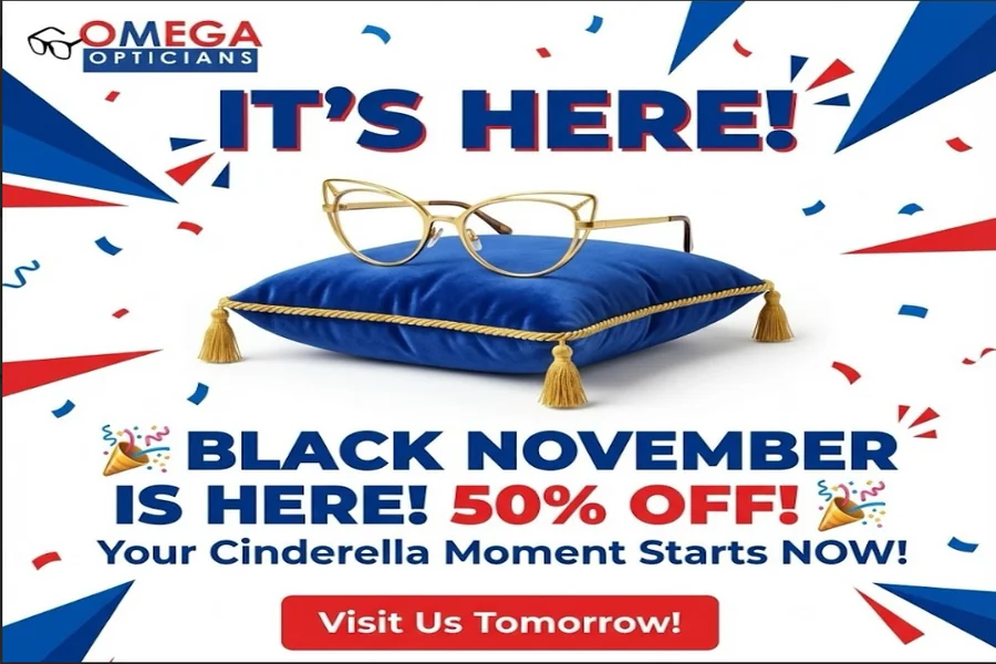
Every great poster needs one main ‘star’ that grabs the eyes the moment someone looks at it. For instance, the gold glasses on the bright blue pillow, placed dead-center, act as a powerful visual focal point.
I find it much more effective to pick a high-quality image that tells the whole story and make it the biggest visual element. You’re giving your audience a clear place to start looking, making the rest of the information much easier to process.
6. Highlight the Key Message
Most people glance at a poster for a few seconds. That’s why when you create posters without design skills, clarity becomes a major advantage.
Your poster should communicate one main message, and everything else should support that. Most importantly, it should be impossible to miss.
I usually start by identifying one thing I want people to remember, such as an event name, discount offer, or bold statement. I then reduce that to a single short sentence and make it dominant by increasing its size or using bold style. Finally, I place it in a high-visibility area, usually top-center or middle. In this Dubai networking poster, the main title is big and white. I also love how they put “1ST DRINK OFFERED” right at the top in gold.
7. Include a Clear Call-to-Action
“What should the reader do next?” This is an important question I ask myself as I’m creating posters. No matter how good your poster looks, people can easily ignore it if it doesn’t tell them what to do next.
A clear CTA gives direction and purpose to the whole design. It should be specific and action-driven, like “Book Your Spot,” “Order Now,” or “Register Now.”
Make the CTA stand out by using a larger font size, bold styling, button-style shape, boxed section, or a contrasting color. Then position it where the eyes naturally land, usually near the center or bottom. You can also support it with details such as a deadline, a website link, or a QR code, as in the example below.
8. Apply These Core Design Principles
A good poster design follows a few basic rules to make everything look neat and intentional. The most important include the following:
- Follow the right visual hierarchy: This hierarchy arranges elements so people see the most important information first. Start with a strong headline, then add supporting details, like date, time, or location.
- Apply the right amount of contrast: Contrast makes your design readable and engaging. It helps separate elements and draw attention where needed. For example, dark text on a light background is easy to read. Use contrast to highlight key areas like headlines or CTAs.
- Align all elements neatly: When elements in the poster line up properly, everything looks organized and professional. You can use grids or guides, if your design tool provides them, to keep everything in place.
- Use plenty of white space: Instead of cramming everything together, use white space to give text and images room to stand out and breathe. This makes your poster easier to read and more visually appealing.
- Choose the right colors: Too many colors can feel messy. Instead, stick to 2–3 main colors that match your message. For example, bold colors work well for promotions, while softer tones suit informational posters.
- Choose simple, readable fonts: Avoid overly decorative styles, especially for body text. Instead, use one font for headings and another for smaller text if needed to keep the design consistent. This will make your poster look clean and easy to understand.
- Be repetitive: Use the same elements throughout your entire design to help the viewer recognize that everything belongs to the same message. It’ll also help build a strong brand identity because people will start to recognize your business just by the specific elements.
Wrapping Up
Now you can confidently create posters without design skills. If you’ve been holding back because you thought or have been afraid that this process was complex, now you know better. I’ve walked you through my design process and what most experienced poster designers typically do.
Honestly, you don’t need to overcomplicate anything or seek perfection. Just start small, experiment with various tools and templates, and keep improving with each poster you make.